1 Why environmental data science?
The magazine U.S. News and World Report annually publishes the best lists for careers. A consistent entry in the top 10 is data science; data science also lands in the top spots in the career website Indeed.com. Setting aside the value of the value of such rankings (Johnes 2018), the United States Bureau of Labor Statistics predicts a 33% increase in data scientists from 2023-2033 (U.S. Bureau of Labor Statistics 2024). To meet this need (and in response to our increasingly data-fied world), data science has arrived as an academic discipline (National Academies of Sciences et al. 2018).
Similarly, the volume and amount of data available to ecologists and environmental scientists has grown (Hampton et al. 2013; Schimel and Keller 2015), allowing for the exploration and analysis of larger-scale questions using data science approaches. This book focuses on environmental data science, and illustrates how data science techniques and mindsets can be applied the analysis of environmental data. We envision this text as a go-to “hitchiker’s” guide to get you up to speed in some of the fascinating ways how data science are expanding our understanding of the natural world. Let’s begin.
1.1 What is environmental data science?
First some terminology. We define data science is the systematic application of principles and techniques to extract insights from a large datasets. These techniques may include data transformation, visualization, statistical modeling, and machine learning (Kelleher and Tierney 2018). Data science involves skills from statistics, computer science, and communication. In many cases data science is confounded with data analytics or data engineers, but it is understood that data science tends to be much broader in scope.
We include the qualifier environmental data science to indicate that the data comes from our natural world. While many of the techniques to analyze environmental data are the same no matter the origin of a data set, the fact that it comes from the environment also requires some additional skill sets and considerations. To see how this plays out, let’s take a look at an example: the influence of weather on natural systems.
1.2 Observing El Niño impacts
The 2023 El Niño event was one of the strongest in recorded history. While this was a global event, its effects were felt acutely in the upper Midwest where there was a snow drought that was captured as a “lost winter”.
To see the impact of this winter, let’s focus in particular on a site located between Wisconsin and the Upper Peninsula in Michigan, the University of Notre Dame Environmental Research Center, which we will refer to as UNDE. This site has been a scientific research site for nearly a century, here UNDE, and here is part of the National Ecological Observatory Network (NEON), which is a publicly-funded continental scale research network.
One of the advantages to NEON is the standardization of instrumentation and data collection across all sites. The data provided by NEON are a good example of open science standards, because the data are findable, accessible (they are not behind a paywall), interoperable (you can download flat CSV files to be used on any statistical software program) and standardized, and re-usable (the measurement can be used to other contexts so that is can work). When dat are findable, accessible, interoperable, and re-usable, we call these data FAIR. FAIR data are explored more in Chapter 4.
1.2.1 Initial data exploration
Figure 1.1 is a screenshot from NEON of soil temperature data at one of the replicate sampling locations in the UNDE soil sensor array. NEON provides a handy interactive data viewer for initial data exploration and viewing. The soil depth shown is the one closest to the surface (2 cm below ground). At first glance, the data viewer shows regular, periodic patterns in soil temperature at UNDE. The El Niño winter of 2023-2024 displays more variability in soil temperature, but from the outset does not appear too anomalous in comparison to the other years.
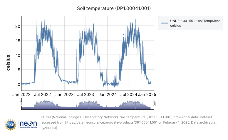
The step of visualizing data on a web site often presents the first inquiry into a data science project. Part of the power of environmental data science is the ability to access and analyze the data on your own. Let’s dig a little deeper - no pun intended.
Figure 1.1 displays several interesting points: soil temperature tends to be more variable near the surface - but during the winter months (December - February), the frozen soil is pretty uniform. While soils were warm from December 2023 - January 2024, they weren’t that anomalous compared to snowfall impacts across the region.
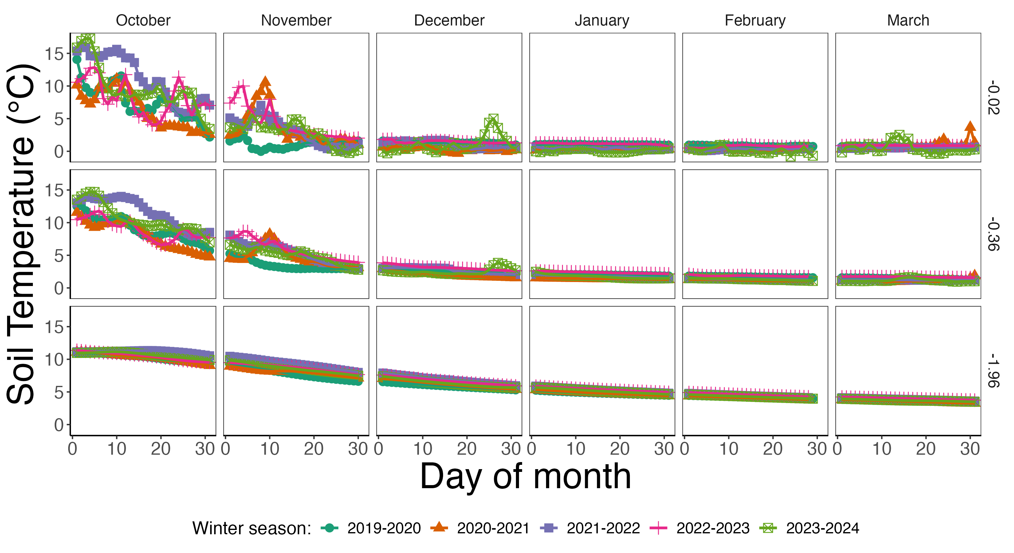
The data used Figure 1.1 comes from several different soil depths and sampling locations, which is an average across all of them. If we wanted to understand what is going on at this NEON site some more, we would need access to more data. Fortunately there are several ways to access NEON data. At a given NEON site, soil temperature is measured at several different spatial locations and depths. In Figure 1.2 we have prepared average daily temperature at each of the different depths October-March of each year. The following work was generated using the statistical software program R and the tidyverse packages, but can be done with any different language (see Chapter 3).
Another way to view the impact of the El Niño winter is to examine the coefficient of variation, which compares the sample mean to the sample standard deviation. We prepared this for each month and winter season using the data used to generate Figure 1.2, shown in Figure 1.3.
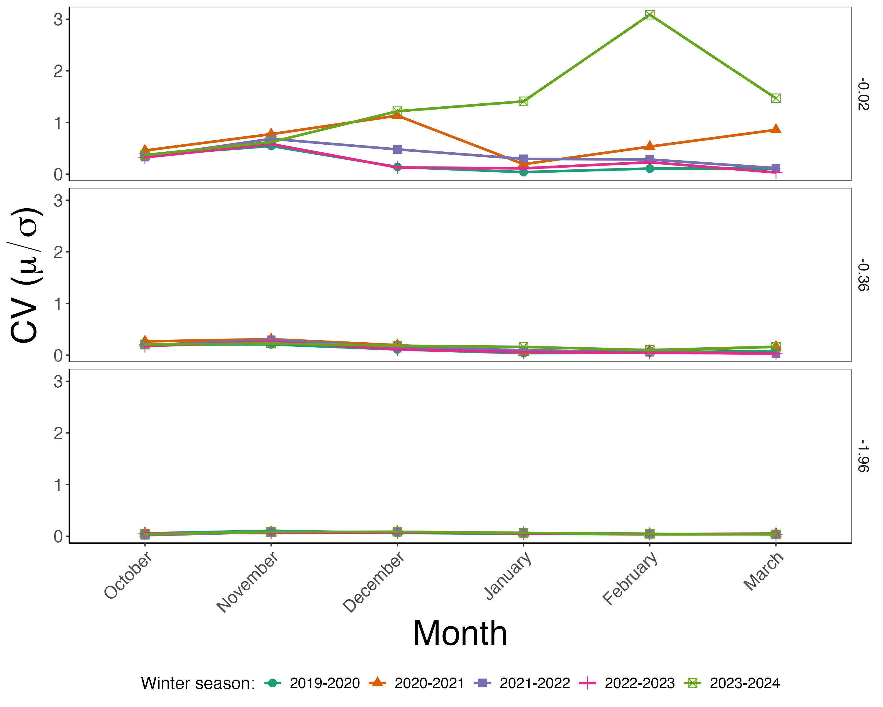
Notice in Figure 1.3 the differences across the different soil depths. While there is variability from one winter season to the next, the soil temperature closer to the surface has a lot more variability compared to the previous depths. Additionally, the winter season of 2023-2024 had approximately 5-6 times more variability in February compared to previous seasons. Figure 1.3 doesn’t conclusively prove that El Niño in 2023-2024 had an impact at this site, but it does provide launching point for future investigations.
This discussion demonstrates the key elements of an environmental data science project: (1) acquisition of high-volume data (daily soil temperature across several years, locations, and depths), (2) visualization and transformation of data (Figures 1.2 and 1.3), and (3) developing additional insights, which we now describe.
1.2.2 Other impacts
A key consideration in environmental data science is also considerations of the broader impacts beyond biogeochemical cycles. The El Niño winter of 2023–2024 may noticeably influence soil temperatures at the UNDE site; the data in Figure 1.3 hint at how year-to-year variability driven by El Niño might ultimately affect the terrestrial carbon cycle (Teckentrup et al. 2021). For example, the vegetation at UNDE consist red and sugar maple trees, also referred to as sugar bush (the stand of trees).
Tapping sugar bush benefits local economies (Wisconsin Extension Maple Program 2024). However, cold springs tend to increase production, and annual production in Wisconsin was lower due to the second consecutive warm spring (U.S. Department of Agriculture, National Agricultural Statistics Service 2024).
What constitutes an appropriate level of sugar bush tapping, particularly given that spring temperatures may vary more from year to year? Any decisions to limit tapping should also respect the rights and sovereignty of all stakeholders.Based on a historical map, the UNDE research site is located on the ancestral lands of the Anishinabewaki and Očhéthi Šakówiŋ peoples. A framework for assessing the impact of sugarbush tapping should incorporate the principles of Indigenous data governance, which affirm Indigenous peoples’ rights and sovereignty over data—including that related to the sugarbush (Carroll et al. 2020). We discuss more of the ethics related to environmental data science in Chapter 4 and other chapters.
1.3 Stepping back to step forward
The previous example showcases some of the approaches to environmental data science. The analysis of initial data exploration followed up by further refinement illustrates the power of environmental data science, and illustrates key aspects of common workflows used over the course of a project.
A typical data science workflow includes importing data, transforming data, modeling and visualization, and communication. Figure 1 in Wickham and Grolemund (2017) illustrates a good visualization of this workflow. Environmental data science has much the same workflow, which we define as a four-step process:
- Staging: includes understanding the type of data that will be used in a particular project you are working in, along with any considerations for the computing environment you are working in. It is important at this stage to also consider how the data are being used and to what end they are accessible.
- Seeking: defines how you will collect, import, and manage the data for your project. The data used for a project could span flat files easily stored on a computer, to data stored in cloud computers. Depending on where the data are located requires different types of skills.
- Skills: are the process of exploration, modeling, and transformation of data. This could require some standard data science tasks (data wrangling, joining), statistical modeling, or data visualization. A key element to this is also understanding efficient ways to loop across multiple groups.
- Sharing: consists of the different ways that your work can be reported out in a variety of formats - ranging from traditional journal articles, interactive dashboards, or contributed code.
While we have defined these aspects separately, there is a degree of fluidity across each of the aspects in a given project. It is ok if you have more skills in one aspect than another! Hopefully this text is to provide a concise resource to use as a lauching pad for you to expand your skills and competencies in each of these aspects. Even a “just in time” approach will help you navigate the different ways that this field is rapidly developing.
1.4 Exercises
Make an inventory of datasets important to you that have accessible data online. This could include weather, aquatic, or other data. Are there real-time updates or dashboards where the data are accessible? How regularly are these data updated?
This chapter defined skills for environmental data science as staging, seeking, and sharing. Which of these three broad categories are your strengths? In which areas do you need to develop?