15 Approaches to visualizing data
Working with large datasets is exciting - but also terrifying because the amount of available data can be overwhelming. Sometime a first approach is to explore by simply visualizing the data. Data science allows for the possibility of a variety of approaches to visualize and present information. As an example, the website 1 dataset 100 visualizations showcases the range of visualization approaches one could use when working with data.
Willingness to engage in exploratory data visualization also goes hand-in-hand with increasing sophistication of visual displays of information in peer-reviewed journals (Friedman 2021). Knowledge and competency of working with multivariate data (GAISE College Report ASA Revision Committee 2016; Legacy et al. 2024) is a high priority in the teaching of undergraduate statistical information. This chapter focuses on ways you can understand association (and perhaps causation) through visual analysis. Let’s begin.
15.1 Data - meet visualization
Let’s return to the dataset of half-hourly NEE from the University of Notre Dame Environmental Research Center (UNDE) introduced in Chapter 14, aggregated to monthly values. Figure 14.3 displays a consistent annual pattern in monthly NEE - positive during winter (when the ecosystem is a net carbon source to the atmosphere), trending negative during the springtime and summer Northern hemisphere (when the ecosystem is a net carbon source to the atmosphere). As the season moves from summer to autumn, then the ecosystem gradually becomes a net carbon source. The visual organization in the horizontal axis showcases how one year compares to each other in the same month. A timeseries in Figure 14.3 may be a default way to show this data, as several years are plotted on top of each other.
Let’s examine three possible variations to display the data in Figure 14.3. The first variation that we will display is an alluvial diagram in Figure 15.1. These diagrams work well to showcase changes in the value of a quantitative variables (in this case monthly NEE) from year to year. The stylistic curves that connect the same months across different years also demonstrate interannual variation for each month.
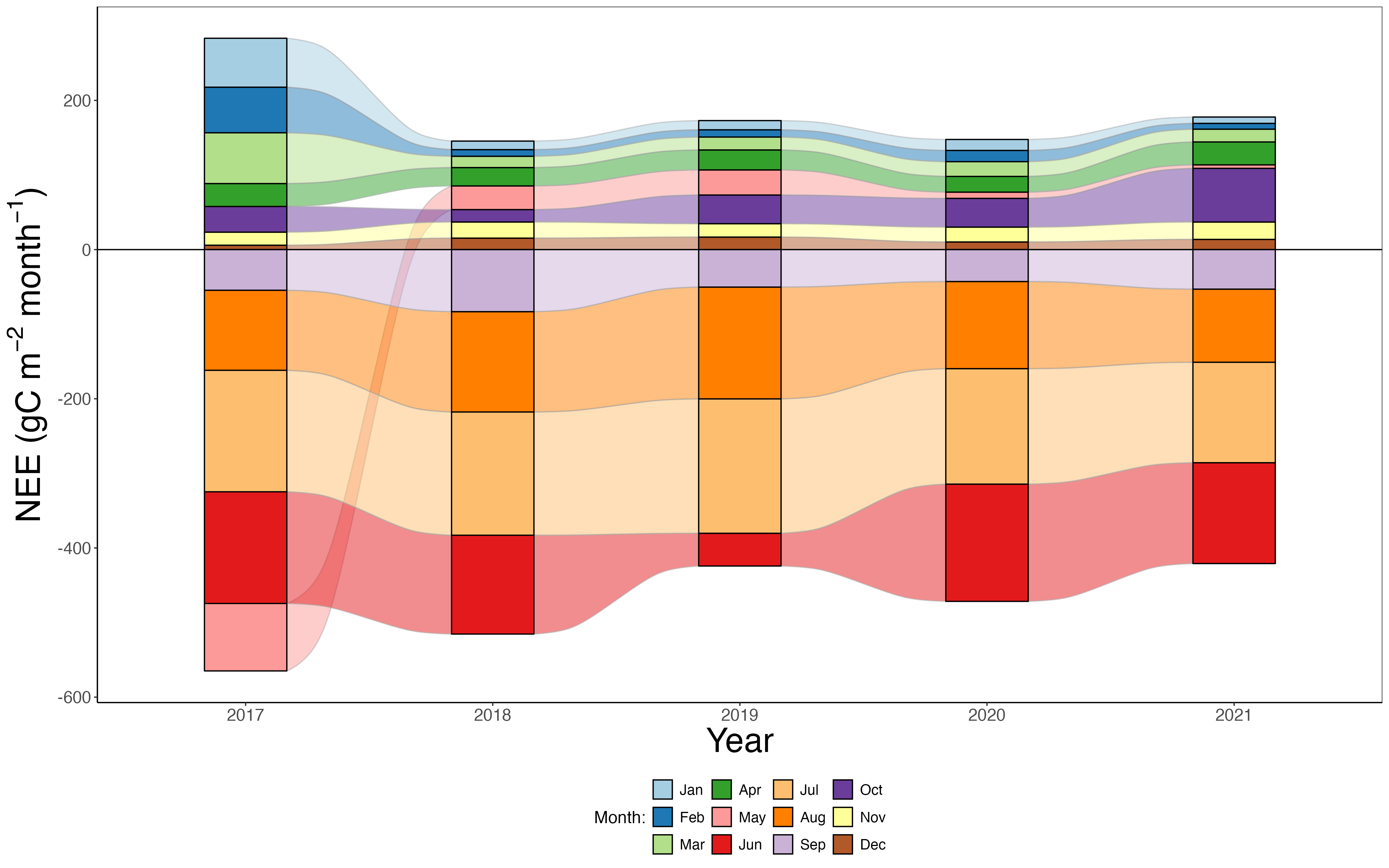
Figure 15.1 provides an easy comparison across the same month in different years. Notice that in May 2017 NEE was a net sink (negative monthly NEE), but in the subsequent years it was a small source. Additionally, the height of each month’s rectangle is a visual cue to compare relative magnitudes across years. If we wanted to aggregate NEE to a yearly total, it would be the difference in the magnitude of the highest positive value and the most negative value for a given year. However what Figure 15.1 does not do well is demonstrate the annual pattern in NEE shown in Figure 14.3. Another benefit is that the annual difference in the source/sink strength can be compared by the relative positive / negative values in each one.
The second variation shown in Figure 15.2 is a fingerprint plot, which is a type of heatmap. Here the tiled and highly structured setup allows for visual uniformity, with each row being a year and each column a month. The color of the tiles corresponds to the values of the monthly NEE. In this case, it may be easier to compare across a row or column and determine than following the flow in Figure 15.1. A disadvantage to the heatmap is that accurately inferring a monthly value depends on the utilized color scale, which could also showcase some additional stylistic tendencies. As with all design choices, one should also account for different ways a viewer may experience and distinguish color scales (Healy 2018). A helpful resource is the colorbrewer website you can investigate and test for different color schemes on qualitative, sequential (light to dark), or diverging (dark to light to dark) scales in a variety of approaches (colorblind, print, or black and white friendly).
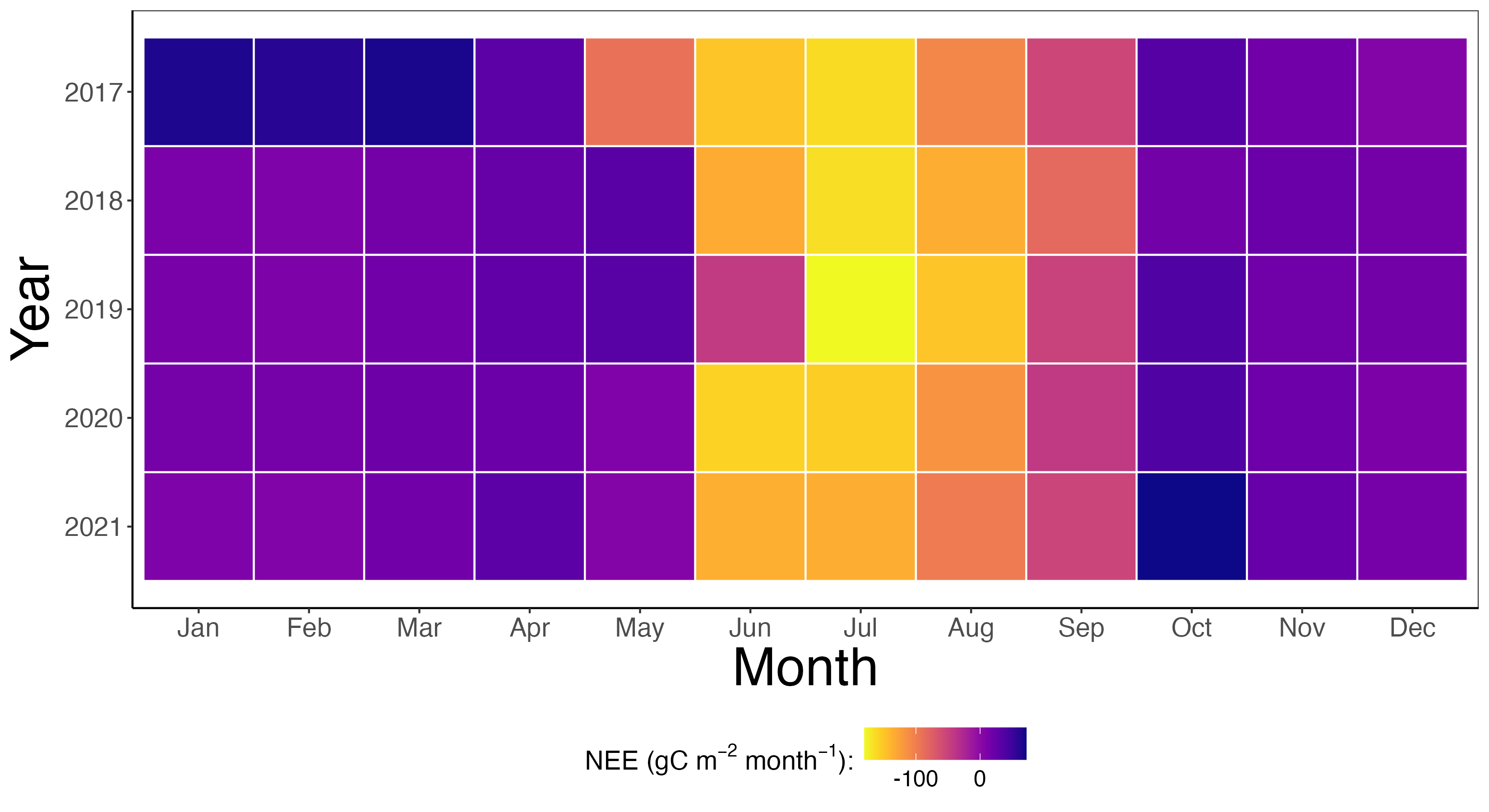
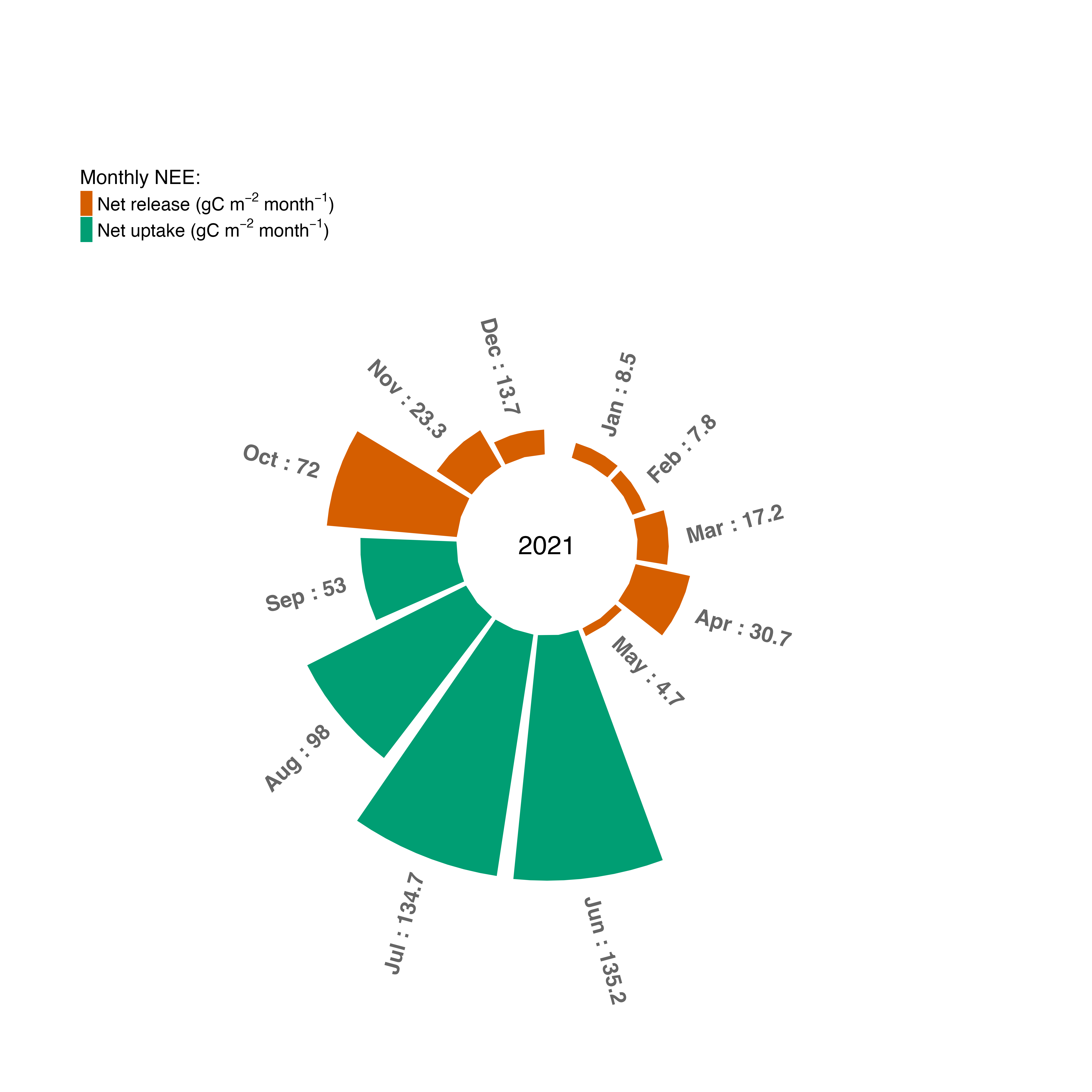
Figure 15.3 showcases a third variation on visualizing the NEE data, called a sunburst plot or rose chart, attributed to statistician and founder of modern nursing Florence Nightingale. The circular nature of Figure 15.3 highlights the circularity of time and the annual pattern to the data. Color is used to emphasize months when the ecosystem is a net source or net sink, with the size (radii) of each circular bar is an indication of the magnitude. While Figure 15.3 displays a single year for clarity, we could include the other years for comparison. One difference in Figure 15.3 compared to Figure 15.1 and Figure 15.2 is that color is used to indicate when the ecosystem is a net source or sink. Arguably a downfall to Figure 15.3 is that it does not showcase the distinct shape of the annual pattern as Figure 14.3 or Figure 15.2.
So what do these different approaches tell us about NEE? Figure 15.1 and Figure 15.2 highlights the month to month variation across each year. In most cases, the months that have a net carbon release or uptake are consistent from year to year (May is one notable exception). The UNDE site is located in a higher latitude in the United States, which in May can experience drastic temperature swings.
We presented three different types of visualizations for the same dataset - but why stop there? Bar charts tend to be the go-to for representing information, at least in terms of popularity across peer-reviewed ecological journals (Riedel et al. 2022; Stuart et al. 2024). Moving outside of bar charts, other approaches could be parallel coordinates plot, which display multiple quantitative variables as spaced parallel lines (Alminagorta et al. 2021).
It is worth mentioning that interactive visualizations are increasingly easier than ever to produce with libraries such as dygraphs, plotly, or shiny. The barriers to move from static to interactive are getting smaller, allowing for innovative ways to present information. We hope that even the small examples presented here will allow for greater exploration on the journey towards rich and engaging data graphics.
15.2 Visualization as emotion
This chapter emphasizes that a goal of visualization and visualization design is to consider carefully consider covariational relationships between data (Tufte 1997). Another key consideration is the fact that visualization does not need to be separated from emotion. Data aren’t neutral, and context needs to be considered (D’Ignazio and Klein 2020). The sunburst plot in Figure 15.3 accentuates the magnitude of carbon loss or uptake from month to month, which may support more of the amount of biological activity compared to the previous two plots.
Even with increased proficiency in working with data, this chapter highlighted some approaches in which we can level up our game. Looking for inspiration? The websites From data to viz and 1 dataset 100 visualizations showcase what could be possible, even with the limited data presented in them.
15.3 Exercises
Note: For these exercises, you can find the dataset unde_nee located here: LINK
Using Figure 15.1 estimate the annual totals of NEE. Using one of the approaches of iteration from Chapter 14, compare your estimated values to the calculated annual total.
Come up with an interesting way to visualize the dataset
unde_nee.Navigate to the colorbrewer website. Choose a color scale that would magnify the impact of the visualization you made from the previous exercise.