26.2 A stochastic system of equations
Let’s examine a stochastic system of differential equations. Here we will return to the lynx-hare model:
\[\begin{equation} \begin{split} \frac{dH}{dt} &= r H - b HL \\ \frac{dL}{dt} &=ebHL -dL \end{split} \end{equation}\]
In this case we still split each equation into the birth (\(\alpha\)) and death (\(\delta\)) parts: \[\begin{align*} \alpha & = \begin{cases} \frac{dH}{dt}: & r H \\ \frac{dL}{dt}: & ebHL\\ \end{cases} \\ \delta & = \begin{cases} \frac{dH}{dt}: & bHL \\ \frac{dL}{dt}: & dL\\ \end{cases} \end{align*}\]
To simulate this stochastic process, the setup of the code is similar to previous ways we solved systems of differential equations. Since we have a system of equations to compute the expected value and variance requires additional knowledge of matrix algebra, but that is already included in the function birth_death_stochastic
# Identify the birth and death parts of the DE:
birth_rate_pred <- c(dH ~ r*H, dL ~ e*b*H*L)
death_rate_pred <-  c(dH ~ b*H*L, dL ~ d*L)

# Identify the initial condition and any parameters
init_pred <- c(H=1, L=3)  # Be sure you have enough conditions as you do variables

# Identify the parameters
parameters_pred <- c(r = 2, b = 0.5, e = 0.1, d = 1)

# Identify how long we run the simulation
deltaT_pred <- .05    # timestep length
time_steps_pred <- 200   # must be a number greater than 1

# Identify the standard deviation of the stochastic noise
sigma_pred <- .1


# Do one simulation of this differential equation
out_pred <- birth_death_stochastic(birth_rate = birth_rate_pred,
                                       death_rate = death_rate_pred,
                                       init_cond = init_pred,
                                       parameters = parameters_pred,
                                       deltaT = deltaT_pred,
                                       n_steps = time_steps_pred,
                                       sigma = sigma_pred)

# Visualize the solution
ggplot(data = out_pred) +
  geom_line(aes(x=t,y=H),color='red') +
  geom_line(aes(x=t,y=L),color='blue') +
labs(x='Time',
     y='Lynx (red) or Hares (blue)')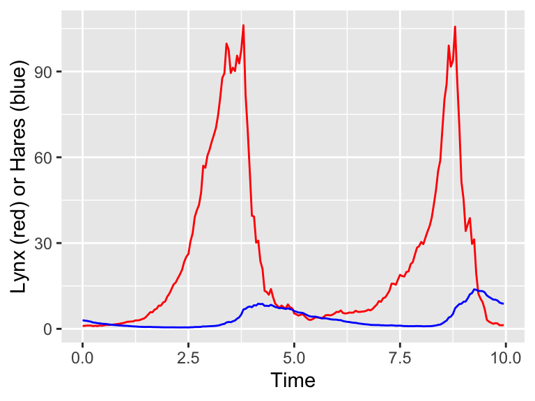
Figure 26.4: One realization of the stochastic predator-prey model.
Excellent! Notice how Figure 26.4 has stochasticity in the variables for both H and L. The next step would be to do many simulations and then compute the ensemble average. First let’s compute the individual simulations:
# Many solutions
n_sims <- 100  # The number of simulations

# Compute solutions
pred_sim <- rerun(n_sims) %>%
  set_names(paste0("sim", 1:n_sims)) %>%
  map(~ birth_death_stochastic(birth_rate = birth_rate_pred,
                                       death_rate = death_rate_pred,
                                       init_cond = init_pred,
                                       parameters = parameters_pred,
                                       deltaT = deltaT_pred,
                                       n_steps = time_steps_pred,
                                       sigma = sigma_pred)
) %>%
  map_dfr(~ .x, .id = "simulation")
The above code may take a while to complete - but this is certainly shorter than computing these all by hand! In order to make the spaghetti plot, we will plot the variables \(H\) and \(L\) separately.
# Plot the hares first:
ggplot(data = pred_sim) +
  geom_line(aes(x=t,y=H,color=simulation)) +
  ggtitle("Spaghetti plot for hares in the predator-prey SDE") +
  guides(color="none")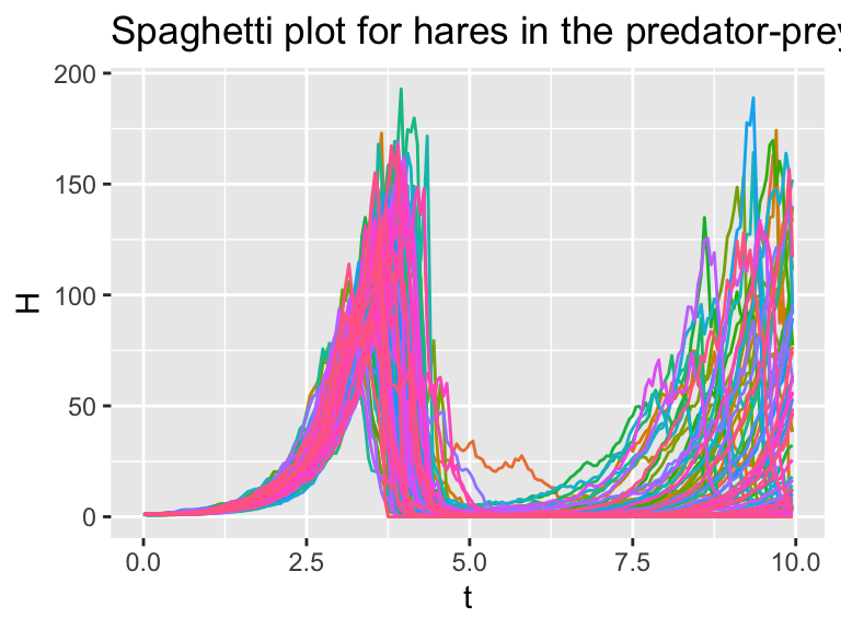
Figure 26.5: Several different realizations of the stochastic predator-prey system.
# Then plot the lynx:
ggplot(data = pred_sim) +
  geom_line(aes(x=t,y=L,color=simulation)) +
  ggtitle("Spaghetti plot for lynx in the predator-prey SDE") +
  guides(color="none")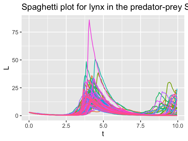
Figure 26.6: Several different realizations of the stochastic predator-prey system.
For the ensemble average plots, we will first utilize the pivot_longer command, group and then summarize:
 ### Summarize the variables
summarized_pred_sim <- pred_sim %>%
  pivot_longer(cols=c("H","L")) %>%
  group_by(name,t) %>%  # All simulations will be grouped at the same timepoint.
  summarise(value = quantile(value, c(0.25, 0.5, 0.75)), q = c("q0.025", "q0.5", "q0.975")) %>%
  pivot_wider(names_from = q, values_from = value)
## `summarise()` has grouped output by 'name', 't'. You can override using the `.groups` argument.# Let's take a look at the resulting data frame
glimpse(summarized_pred_sim)## Rows: 400
## Columns: 5
## Groups: name, t [400]
## $ name <chr> "H", "H", "H", "H", "H", "H", "H", "H", "H", "H", "H", "H", "H"…
## $ t <dbl> 0.00, 0.05, 0.10, 0.15, 0.20, 0.25, 0.30, 0.35, 0.40, 0.45, 0.5…
## $ q0.025 <dbl> 1.0000000, 0.9739683, 0.9704827, 0.9850577, 0.9916619, 1.031269…
## $ q0.5 <dbl> 1.000000, 1.024874, 1.046321, 1.050366, 1.075298, 1.140154, 1.1…
## $ q0.975 <dbl> 1.000000, 1.080082, 1.091934, 1.139265, 1.212339, 1.248552, 1.3…Let’s break this down:
- The data frame
pred_simhas columnssimulation,t,H, andL. We want to group each variable by the timet. In order to do that efficiently we need to pivot the data frame longer. By applying the commandpivot_longer(cols=c("H","L"))we will still have 4 columns, but this time they are calledsimulation,t,name, andvalue. The columnnameis a categorical variable that is eitherHorL(the columns we made longer), and the columnvaluehas the numerical values for both at each time. - We then group by the column
namefirst, and then bytime. - The remainder of the code is similar to how we computed the ensemble average above.
The tricky part is that resulting columns of summarized_pred_sim are name, t, and the quantile values. This may seem a challenge to plot, but we can easily make a small multiples plot with the command facet_grid:
ggplot(data = summarized_pred_sim) +
  geom_line(aes(x = t, y = q0.5)) +
  geom_ribbon(aes(x=t,ymin=q0.025,ymax=q0.975),alpha=0.2) +
  facet_grid(. ~ name)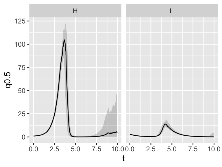
Figure 26.7: Ensemble average plot of the predator-prey system.
The last command facet_grid(. ~ name) splits the plot up into different panels (or facets) by the column name. So easy to make!
If you are feeling a little overwhelmed by all these new plotting commands - don’t worry. You can easily modify these examples for a different systme of differential equations. You’ve got this!