22.1 Ensemble Averages
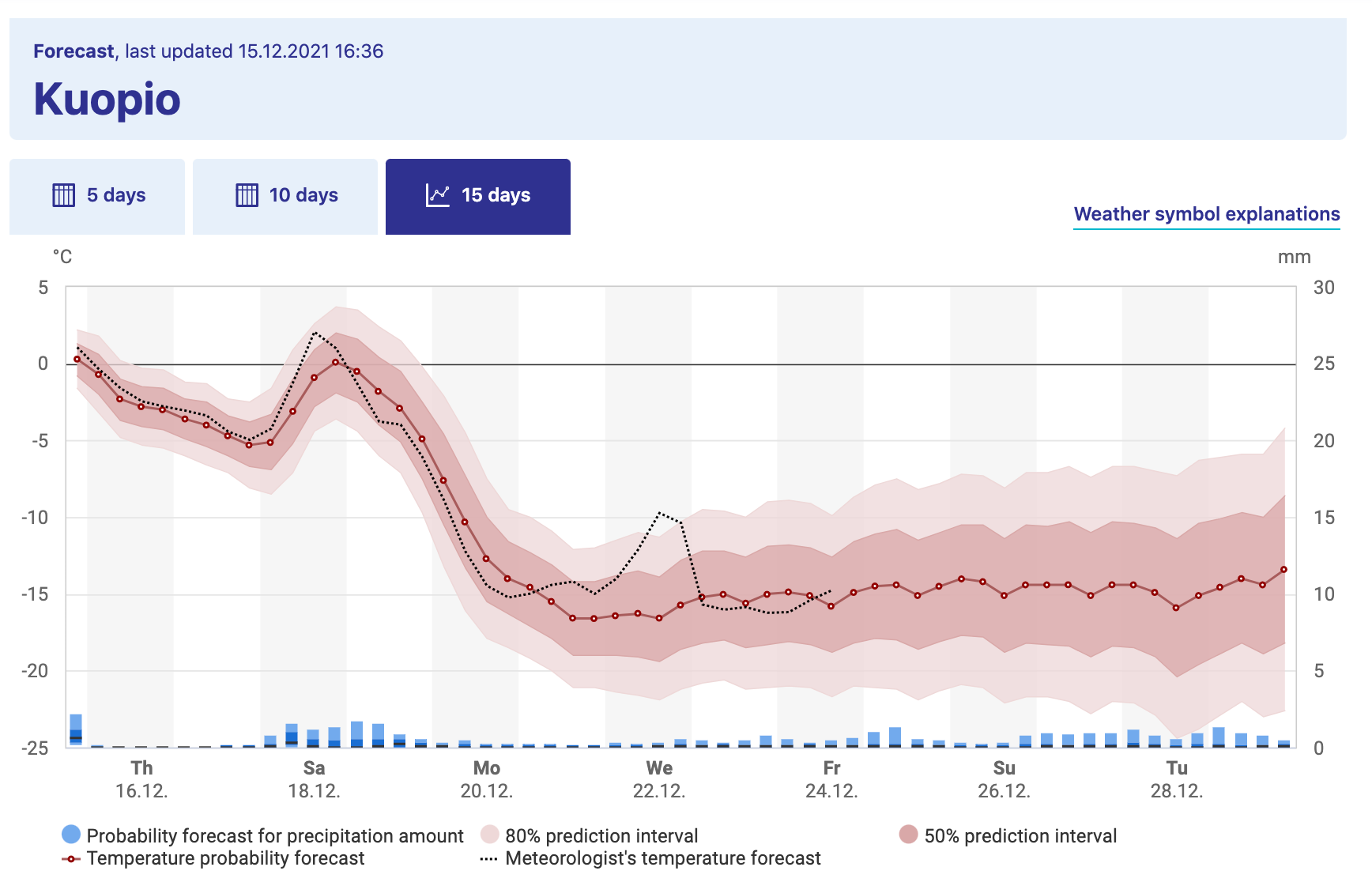
Consider Figure 22.1, which shows the weather forecast for Kuopio, a city in Finland:8

Figure 22.1: Long-term weather forecast for Kuopio, a city in Finland, from the Finnish Weather Institute.
Figure 22.1 shows a great example of what is called an ensemble average. The horizontal axis lists the time of day and the vertical axis is the temperature (the precipitation is in bars down below, but not important in this context). The forecast temperature at a given point in time can have a range of outcomes, with the median of the distribution as the “temperature probability forecast”9. The red shading states that 80% of the outcomes fall in a given range, so while the median temperature on Tuesday May 5 (labeled as Tu 4.5 - dates are represented as DAY-MONTH-YEAR) is 7 \(^{\circ}\)C, it may range between 4 and 11 \(^{\circ}\)C (39 to 51 \(^{\circ}\)F). Based on the legends given, the 80% confidence interval is between 4 - 11 \(^{\circ}\)C, or the models have 80% confidence for the temperature to be between that range of temperatures.
Because there may be different factors that alter the weather in a particular spot (e.g. the timing of a low-pressure front, or clouds, etc) there are different possibilities for an outcome of the weather forecast. While that may seem like forecasting weather may impossible to do, sometimes these changes lead to small fluctuations in the forecasted weather at a given point. The further out in time the more ensemble average becomes more uncertain (wider bars), as unforeseen events may drastically change the weather in the long term.
In this section we will focus on how to take results from a simulation (such as several simulations of the moose population from Section 21) to generate ensemble average plots. Computing an ensemble average is a great way to show your uncertainty or confidence in a model outcome.