2.5 Visualization with R
Now we are ready to begin visualizing data frames. Two types of plots that we will need to make will be a scatter plot and a line plot. We are going to consider both of these separately, with examples that you should be able to customize.
2.5.1 Making a scatterplot
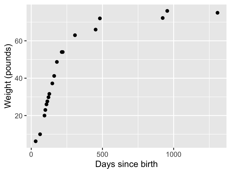
One dataset we have is the mass of a dog over time, adapted from here. We have two variables here: \(D=\) the age of the dog in days and \(W=\) the weight of the dog in pounds. I have the data loaded into the demodelr package, which you can investigate by typing the following at the command line (I display it below as well in Table 2.3).
glimpse(wilson)(Notice that I have assumed you have the demodelr library loaded.) You can also explore the documentation for this dataset by typing ?wilson at the console.
| days | mass |
|---|---|
| 31 | 6.25 |
| 62 | 10.00 |
| 93 | 20.00 |
| 99 | 23.00 |
| 107 | 26.00 |
| 113 | 27.60 |
| 121 | 29.80 |
| 127 | 31.60 |
| 148 | 37.20 |
| 161 | 41.20 |
| 180 | 48.70 |
| 214 | 54.00 |
| 221 | 54.00 |
| 307 | 63.00 |
| 452 | 66.00 |
| 482 | 72.00 |
| 923 | 72.20 |
| 955 | 76.00 |
| 1308 | 75.00 |
Notice that this data frame has two variables: days and mass
To make a scatter plot of these data we are going to use the command ggplot:
ggplot(data = wilson) +
  geom_point(aes(x = days, y = mass)) +
  labs(
    x = "Days since birth",
    y = "Weight (pounds)"
  )
Wow! This looks complicated. Let’s break this down step by step:
ggplot(data = wilson) +sets up the graphics structure and identifies the name of the data frame we are including.
geom_point(aes(x = days, y = mass))defines the type of plot we are going to be making.
geom_point()defines the type of plot geometry (or geom) we are using here - in this case, a point plot.aes(x = days, y = mass)determines the aesthetics of the plot. On the x axis is the days variable, on the y axis is the mass variable.- The statement beginning with
labs(x=...)defines the labels on the x and y axes.
I know this seems like a lot to write for a plot, but this structure is actually used for some more advanced data visualization. Trust me - learning how to make informative plots can be a useful skill!
2.5.2 Making a line plot
Using the same wilson data, later on we will discover that the function \(\displaystyle W =f(D)= \frac{70}{1+e^{2.46-0.017D}}\). represents these data. In order to make a plot of this function we can use need to first build a data frame:
days <- seq(from = 0, to = 1500, by = 1) # Choose spacing that is "smooth enough"
mass <- 70 / (1 + exp(2.46 - 0.017 * days))

wilson_model <- tibble(
  days = days,
  mass = mass
)

ggplot(data = wilson_model) +
  geom_line(aes(x = days, y = mass)) +
  labs(
    x = "Days since birth",
    y = "Weight (pounds)"
  )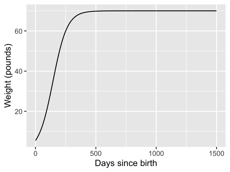
Notice that once we have the data frame set up, the structure is very similar to the scatter plot - but this time we are calling using geom_line() than geom_point.
2.5.3 Changing options
Want a different color? Thicker line? That is fairly easy to do. For example if we wanted to make either our points or line a different color, we can just choose the following:
ggplot(data = wilson) +
  geom_point(aes(x = days, y = mass), color = "red", size = 2)
labs(
  x = "Days since birth",
  y = "Weight (pounds)"
)
Notice how the command color='red' was applied outside of the aes - which means it gets mapped to each of the points in the data frame. size=2 refers to the size (in millimeters) of the points. I’ve linked more options about the colors and sizes you can use here:
2.5.4 Combining scatter and line plots.
This is actually easy to do, especially since we are combining both the plot geoms together. Try running the following code (I am still using the data frame wilson_model as defined above:
ggplot(data = wilson) +
  geom_point(aes(x = days, y = mass), color = "red") +
  geom_line(data = wilson_model, aes(x = days, y = mass)) +
  labs(
    x = "Days since birth",
    y = "Weight (pounds)"
  )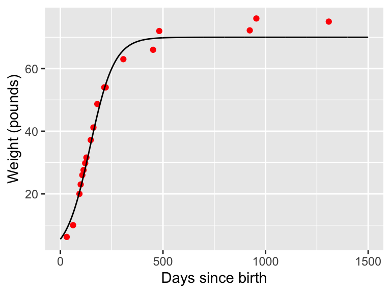
Notice in the above code a subtle difference when I added in the dataset wilson_model with geom_line: you need to name the data bringing in a new data frame to a plot geom.
While it may be useful to have a legend to the plot, for this course we will make plots where this the context will be more apparent. Additional reading on legends can be found here.