9.4 Plotting likelihood surfaces
Ok, we are going to examine a second example from Gause (1932) which modeled the growing of yeast in solution. This classic paper examines the biological principal of competitive exclusion, how one species can out compete another one for resources. The data from Gause (1932) is encoded in the data frame yeast in the demodelr package. For this example we are going to examine a model for one species growing without competition. Figure 9.10 shows a scatterplot of the yeast data.
### Make a quick ggplot of the data

ggplot() +
  geom_point(
    data = yeast,
    aes(x = time, y = volume),
    color = "red",
    size = 2
  ) +
  labs(x = "Time", y = "Volume")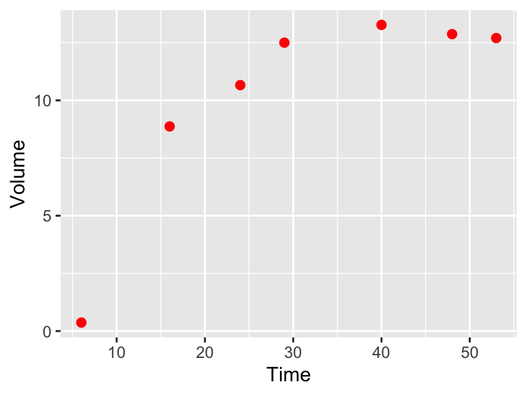
Figure 9.10: Scatterplot of Sacchromyces volume growing by itself in a container.
We are going to assume the population of yeast (represented with the measurement of volume) over time changes according to the equation:
\[\begin{equation} \frac{dy}{dt} = -by \frac{(K-y)}{K}, \tag{9.3} \end{equation}\]
where \(y\) is the population of the yeast and \(b\) represents the growth rate and \(K\) is the carrying capacity of the population. It can be shown that the solution to this differential equation is \(\displaystyle y = \frac{K}{1+e^{a-bt}}\), where the additional parameter \(a\) can be found through application of the initial condition \(y_{0}\). In Gause (1932) the value of \(a\) was determined by solving the initial value problem \(y(0)=0.45\). In Exercise 9.1 you will show that \(\displaystyle a = \ln \left( \frac{K}{0.45} - 1 \right)\).
Equation (9.3) has two parameters: \(K\) and \(b\). Here we are going to explore the likelihood function to try to determine the best set of values for the two parameters \(K\) and \(b\) using the function compute_likelihood. Inputs to the compute_likelihood function are the following:
- A function \(y=f(x,\vec{\alpha})\)
- A dataset \((x,y)\)
- Ranges of your parameters \(\vec{\alpha}\).
The compute_likelihood function also has an optional input logLikely that allows you to specify if you want to compute the likelihood or the log likelihood. The default is that logLikely is FALSE, meaning that the normal likelihoods are plotted.
First we will define the equation used to compute our model in the likelihood. As with the functions euler or systems we need to define this function:
library(demodelr)

# Gause model equation
gause_model <- volume ~ K / (1 + exp(log(K / 0.45 - 1) - b * time))


# Identify the ranges of the parameters that we wish to investigate
kParam <- seq(5, 20, length.out = 100)
bParam <- seq(0, 1, length.out = 100)


# Allow for all the possible combinations of parameters
gause_parameters <- expand.grid(K = kParam, b = bParam)

# Now compute the likelihood
gause_likelihood <- compute_likelihood(
  model = gause_model,
  data = yeast,
  parameters = gause_parameters,
  logLikely = FALSE
  )
Ok, let’s break this code down step by step:
- The line
gause_model <- volume ~ K/(1+exp(log(k/0.45-1)-b*time))identifies the formula that relates the variablestimetovolume. - We define the ranges (minimum and maximum values) for our parameters by defining a sequence. Because we want to look at all possible combinations of these parameters we use the command
expand.grid. - The input
logLikely = FALSEtocompute_likelihoodreports back likelihood values.
Some care is needed in defining the number of points that we want to evaluate - we will have \(100^{2}\) different combinations of \(K\) and \(b\), which do take time to evaluate.
The output to compute_likelihood is a list - this is a flexible data structure. You can think of this as a collection of items. In this case, what gets returned are two data frames: likelihood, which is a data frame of likelihood values for each of the parameters and opt_value, which reports back the values of the parameters that optimize the likelihood function. Note that the optimum value is an approximation, as it is just the optimum from the input values. Let’s take a look at the reported optimum values, which we can do with the syntax LIST_NAME$VARIABLE_NAME, where the dollar sign ($) helps identify which variable from the list you are investigating.
gause_likelihood$opt_value## # A tibble: 1 × 4
## K b l_hood log_lik
## <dbl> <dbl> <dbl> <lgl>
## 1 12.7 0.242 0.000348 FALSEIt is also important to visualize this likelihood function. For this dataset we have the two parameters \(K\) and \(b\), so the likelihood function will be a likelihood surface. The code to generate the plot looks a little different from previous plots we have used previously:
# Define the likelihood values
my_likelihood <- gause_likelihood$likelihood

# Make a contour plot
ggplot(data = my_likelihood) +
  geom_tile(aes(x = K, y = b, fill = l_hood)) +
  stat_contour(aes(x = K, y = b, z = l_hood))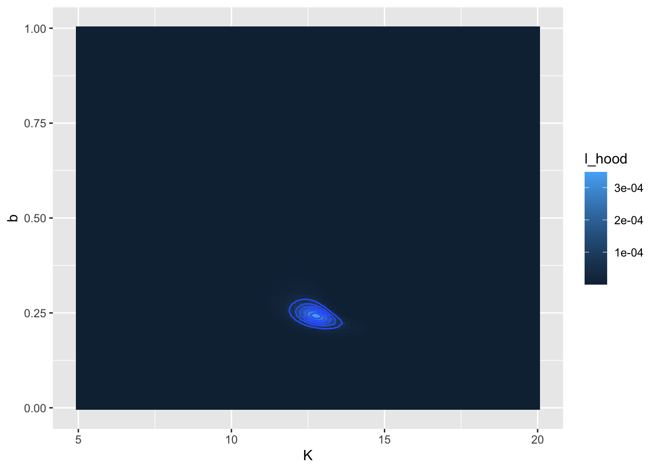
Figure 9.11: Likelihood surface and contour lines for the Gause dataset.
Similar to before, let’s take this step by step:
- The command
my_likelihoodjust puts the likelihood values in a data frame. - The
ggplotcommand is similar as before. - We use
geom_tileto visualize the likelihood surface. There are three required inputs from themy_likelihooddata frame: thexandyaxis data values and thefillvalue, which represents the height of the likelihood function. - The command
stat_contourdraws the contour lines, or places where the likelihood function is the same. Notice how we usedz = l_hoodrather thanfillhere.
I chose some broad parameter ranges at first, so let’s make a likelihood plot, exploring parameters closer to the last optimum value:
# Gause model equation
gause_model <- volume ~ K / (1 + exp(log(K / 0.45 - 1) - b * time))


# Identify the (new) ranges of the parameters that we wish to investigate
kParam <- seq(11, 14, length.out = 100)
bParam <- seq(0.1, 0.3, length.out = 100)


# Allow for all the possible combinations of parameters
gause_parameters_rev <- expand.grid(K = kParam, b = bParam)


gause_likelihood_rev <- compute_likelihood(
  model = gause_model,
  data = yeast,
  parameters = gause_parameters_rev,
  logLikely = FALSE
  )

# Report out the optimum values
opt_value_rev <- gause_likelihood_rev$opt_value

opt_value_rev
## # A tibble: 1 × 4
## K b l_hood log_lik
## <dbl> <dbl> <dbl> <lgl>
## 1 12.8 0.241 0.000349 FALSE# Define the likelihood values
my_likelihood_rev <- gause_likelihood_rev$likelihood
# Make a contour plot
ggplot(data = my_likelihood_rev) +
geom_tile(aes(x = K, y = b, fill = l_hood)) +
stat_contour(aes(x = K, y = b, z = l_hood)) +
geom_point(data = opt_value_rev, aes(x = K, y = b), color = "red")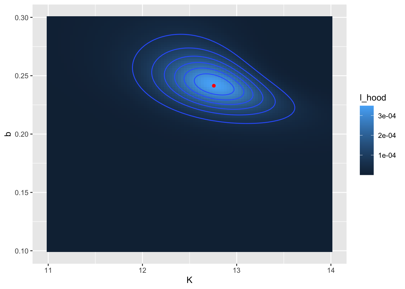
Figure 9.12: Revised likelihood surface. The computed location of the optimum value is shown as a red point.
The reported values for \(K\) (12.8) and \(b\) (0.241) may be close to what was reported from Figure 9.11. Notice that in Figure 9.12 I also added in the location of the optimum point with the code geom_point(data=opt_value_rev,aes(x=k,y=b),color='red').
Finally we can use the optimized parameters to compare the function against the data (Figure 9.13.
# Define the parameters and the times that you will evaluate the equation
my_params <- gause_likelihood_rev$opt_value
time <- seq(0, 60, length.out = 100)

# Get the right hand side of your equations
new_eq <- gause_model %>%
  formula.tools::rhs()

# This collects the parameters and data into a list
in_list <- c(my_params, time) %>% as.list()

# The eval command evaluates your model
out_model <- eval(new_eq, envir = in_list)


# Now collect everything into a dataframe:
my_prediction <- tibble(time = time, volume = out_model)


ggplot() +
  geom_point(
    data = yeast,
    aes(x = time, y = volume),
    color = "red",
    size = 2
  ) +
  geom_line(
    data = my_prediction,
    aes(x = time, y = volume)
  ) +
  labs(x = "Time", y = "Volume")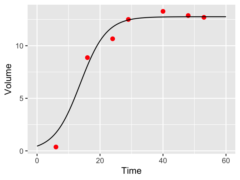
Figure 9.13: Model and data comparison of the yeast dataset from maximum likelihood estimation.
All right, this code block has some new commands and techniques that need explaining. Once we have the parameter estimates we need to compute the modeled values.
- First we define the
paramsand thetimewe wish to evaluate with our model. - We need to evaluate the right hand side of \(\displaystyle y = \frac{K}{1+e^{a+bt}}\), so the definition of
new_eqhelps to do that, using the packageformula.tools. - The
%>%is thetidyversehttps://r4ds.had.co.nz/pipes.html#pipes. This is a very useful command to help make code more readable! in_list <- c(params,my_time) %>% as.list()collects the parameters and input times in one list to evaluate the model without_model <- eval(new_eq,envir=in_list)- In order to plot we make a data frame
my_prediction
And the rest of the plotting commands you should be used to.