11.1 Plotting histograms in R
In Section 9 we discussed probability distributions. Now we are going to discuss them a little more, but now we will first discuss plotting histograms in R. A quick recap of a histogram: this is a binned plot of data, where there are some predefined bins and we count the number of observations in each bin.
Consider the dataset of snowfall observations from weatherstations in Minnesota shown in Table 11.1, with the following table.
knitr::kable(snowfall, caption = "Weather station data from a Minnesota snowstorm.")| date | time | station_id | station_name | snowfall |
|---|---|---|---|---|
| 4/16/18 | 5:00 AM | MN-HN-78 | Richfield 1.9 WNW | 22.0 |
| 4/16/18 | 7:00 AM | MN-HN-9 | Minneapolis 3.0 NNW | 19.0 |
| 4/16/18 | 7:00 AM | MN-HN-14 | Minnetrista 1.5 SSE | 12.5 |
| 4/16/18 | 7:00 AM | MN-HN-30 | Plymouth 2.4 ENE | 18.5 |
| 4/16/18 | 7:00 AM | MN-HN-58 | Champlin 1.5 ESE (118) | 20.0 |
| 4/16/18 | 7:00 AM | MN-HN-89 | Edina 1.7 N | 11.0 |
| 4/16/18 | 7:00 AM | MN-HN-110 | Edina 1.9 SSE | 15.5 |
| 4/16/18 | 7:00 AM | MN-HN-134 | Brooklyn Center 1.1 E | 13.5 |
| 4/16/18 | 7:00 AM | MN-HN-150 | Maple Grove 1.8 NE | 22.0 |
| 4/16/18 | 8:00 AM | MN-HN-17 | Eden Prairie 3.3 WSW | 16.0 |
| 4/16/18 | 8:00 AM | MN-HN-72 | Maple Grove 2.9 NE | 13.0 |
| 4/16/18 | 8:00 AM | MN-HN-175 | Bloomington 2.0 SE | 13.1 |
| 4/16/18 | 8:30 AM | MN-HN-19 | Edina 1.3 SW | 11.0 |
| 4/16/18 | 8:30 AM | MN-HN-31 | Maple Grove 1.0 NNE | 19.5 |
| 4/16/18 | 6:00 PM | MN-HN-215 | Richfield 1.4 W | 18.0 |
| 4/16/18 | 10:30 PM | MN-HN-5 | New Hope 1.9 S | 13.0 |
A histogram is an easy way to view the distribution of measurements. Doing a histogram in R is easy to do:
ggplot(data = snowfall) +
  geom_histogram(aes(x = snowfall), ) +
  labs(
    x = "Snowfall amount",
    y = "Number of observations"
  )
## `stat_bin()` using `bins = 30`. Pick better value with `binwidth`.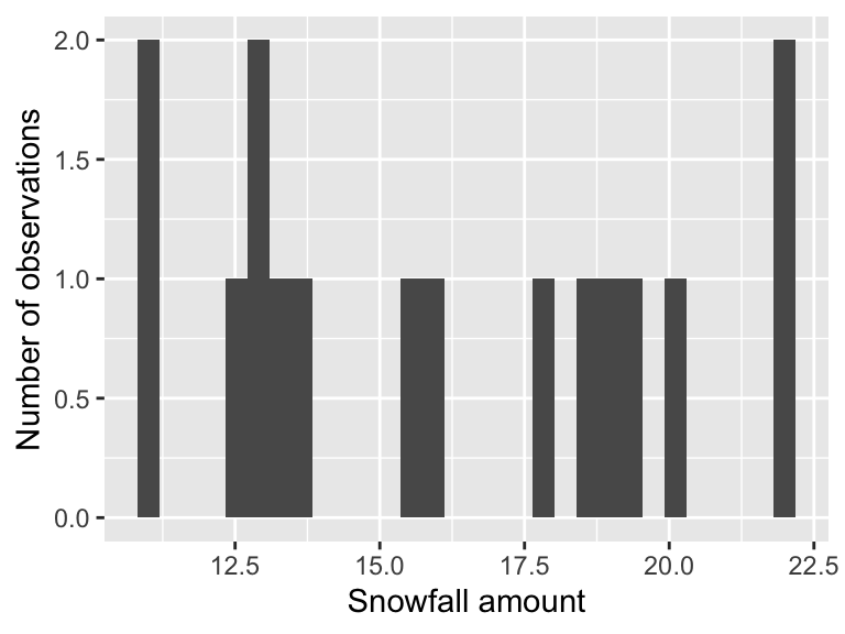
This code introduces geom_histogram. Notice , which has two key inputs:
- The code
aes(x = snowfall)is computing the histogram for thesnowfallcolumn in the datasetsnowfall. You may have received a warning about the binsstat_bin()` using `bins = 30`. Pick better value with `binwidth, so let’s adjust the number of bins to 4:
ggplot() +
  geom_histogram(data = snowfall, aes(x = snowfall), bins = 4) +
  labs(
    x = "Snowfall amount",
    y = "Number of observations"
  )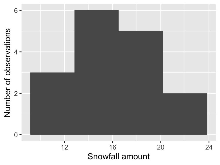
The resulting histogram may look blockier, but that is ok.